Lastly, Volume 1 is the ONLY way to get this updated art. We won't be updating the webcomic or the previously released issues.
Showing posts with label Process. Show all posts
Wednesday, June 24, 2015
STS-71: Of Stars and Swords Volume 1 Art Updates
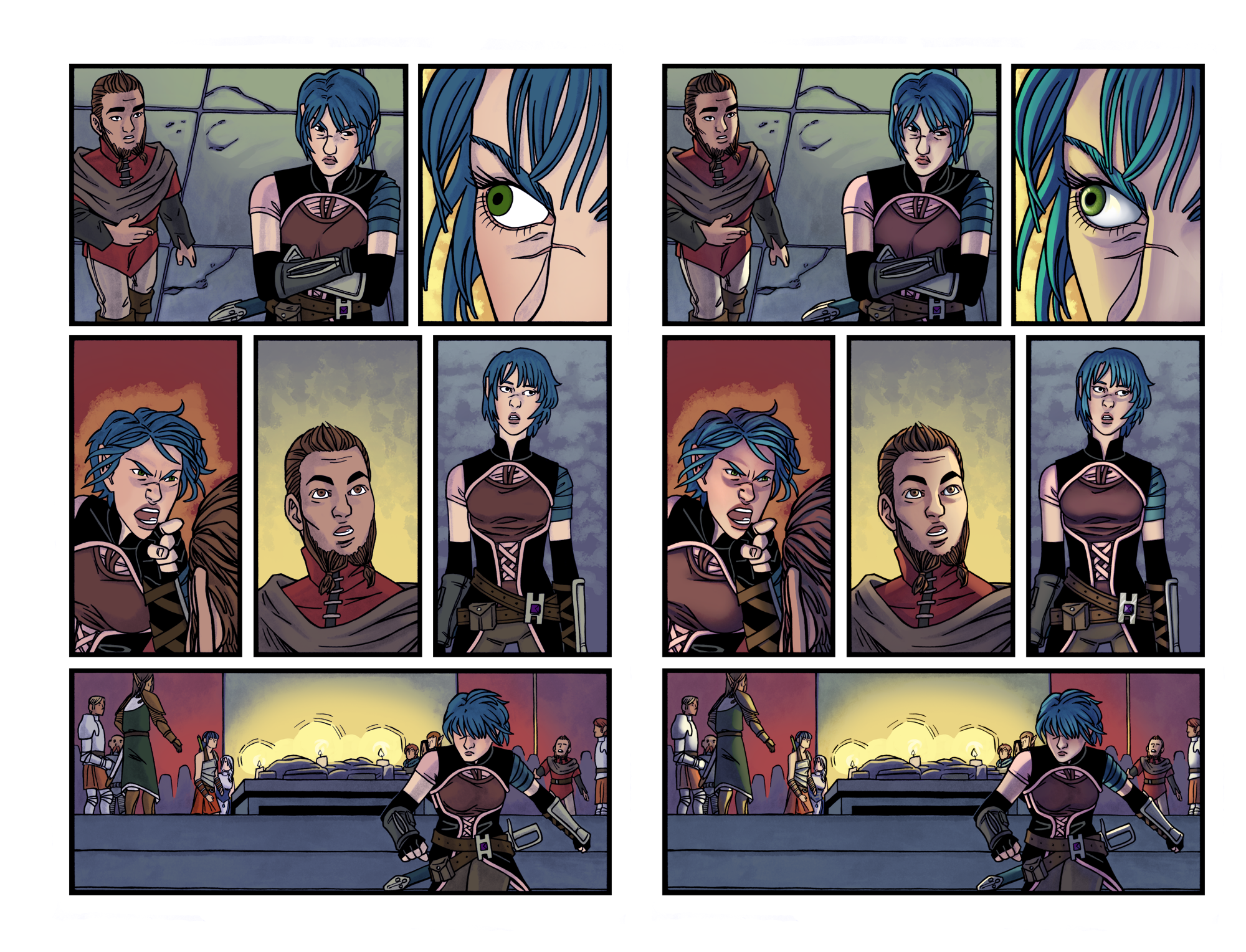
As of today, Of Stars and Swords Vol 1: The Mad Lord is out on Comixology! It contains the complete first story arc for the comic, as well as some extra things like a new short comic and, importantly, updated art. To give you an idea of what that means for the art (and the lettering in most cases), Caroline put together a number of comparison panels that we've shared in the past few months, and I wanted to compile them all here for easy viewing.
Lastly, Volume 1 is the ONLY way to get this updated art. We won't be updating the webcomic or the previously released issues.


Lastly, Volume 1 is the ONLY way to get this updated art. We won't be updating the webcomic or the previously released issues.
Saturday, March 28, 2015
STS-70: Of Stars and Swords Character Design: Seren
Here's the last of the updated designs for the Of Stars and Swords cast in arc 2: Seren! She was the hardest to get right, mainly because I was hesitant to change her look after the first arc...but she's not a superhero, so there's no good reason for her not to change when the rest of the csat designs looked so good.

We were originally planning on keeping Seren’s outfit from arc 1, and just updating her belt, daggers, and arm armour. But as everyone else’s designs started coming together, we realized she just wasn’t as interesting in comparison and I really wanted to continue the trend of changing her look to line up with changes to her self-identity. Her new outfit is an upgrade focusing on hilighting her strengths: stealth, speed, and connections. We also decided to visibly link her to the Dorae-Kos by creating an emblem for them that’s kinda hard to miss on her back.
I'll leave the rest to Caroline.
We were originally planning on keeping Seren’s outfit from arc 1, and just updating her belt, daggers, and arm armour. But as everyone else’s designs started coming together, we realized she just wasn’t as interesting in comparison and I really wanted to continue the trend of changing her look to line up with changes to her self-identity. Her new outfit is an upgrade focusing on hilighting her strengths: stealth, speed, and connections. We also decided to visibly link her to the Dorae-Kos by creating an emblem for them that’s kinda hard to miss on her back.
Friday, March 27, 2015
STS-69: Of Stars and Swords Character Design: Kyros
Today's look at the Of Stars and Swords Arc 2 character is Cato's brother, Kyros! I'll leave the explaining to Caroline...

After we figured out Cato we started applying his reject designs to a base for Kyros, this group’s heavy. Kyros needed to look like the kid who always wanted to join the army, but never had the discipline for it. His early designs were too muddy and bland, and didn’t give a strong silhouette (and we didn’t want to go the gladiator route). Our biggest challenge was keeping him from looking like Chloe 2.0. His final outfit borrows strongly from Greek and Roman armours, with a chevalier-inspired upper chest guard.
Thursday, March 26, 2015
STS-68: Of Stars and Swords Character Design: Kieran
Time for another look at the Of Stars and Swords Arc 2 cast. This time it's Kieran, who we've shown off more than a few times and, like Maeira, now looks completely different!

Kieran was also held back by his original design from a few years ago. While we were streamlining him, we decided to ditch the bow and let him focus on his swords exclusively. Most of Kieran’s changes have come as a result of Graham figuring him out while writing scripts for arc 2. His personality and attitude weren’t matching the sketches I was putting together. He needed to be sharper featured, and more rugged and militarian. The final costume was inspired by Japanese Samurai armour (jinbaori for the coat, kyahan for the leg gaiters, and even the sword placements), Game of Thrones (primarily outerwear worn by the Starks) and the streamlined fantasy designs in Dragon Age.
Now I'll stop typing and leave the rest to Caroline's words.
Kieran was also held back by his original design from a few years ago. While we were streamlining him, we decided to ditch the bow and let him focus on his swords exclusively. Most of Kieran’s changes have come as a result of Graham figuring him out while writing scripts for arc 2. His personality and attitude weren’t matching the sketches I was putting together. He needed to be sharper featured, and more rugged and militarian. The final costume was inspired by Japanese Samurai armour (jinbaori for the coat, kyahan for the leg gaiters, and even the sword placements), Game of Thrones (primarily outerwear worn by the Starks) and the streamlined fantasy designs in Dragon Age.
Wednesday, March 25, 2015
STS-67: Of Stars and Swords Character Design: Anica
Here's another look at a character for Of Stars and Swords Arc 2! This is Anica, the only character that we managed to nail down on the first go.
Now here's Caroline's design and her talking about it.

We got lucky with Anica, I knew exactly how she needed to look from the beginning. Our goal was to borrow shapes found in Ancient Egyptian clothing, but combine them in a different way. I wanted her to look like a wealthy merchant’s daughter, so her clothing needed to be rich and colorful, while also practical for daily wear.
Now here's Caroline's design and her talking about it.
We got lucky with Anica, I knew exactly how she needed to look from the beginning. Our goal was to borrow shapes found in Ancient Egyptian clothing, but combine them in a different way. I wanted her to look like a wealthy merchant’s daughter, so her clothing needed to be rich and colorful, while also practical for daily wear.
Tuesday, March 24, 2015
STS-66: Of Stars and Swords Character Design: Cato
Next up in the look at the character designs for Of Stars and Swords Arc 2 is Cato. As you can see, he went through some fairly dramatic changes, and I'll let Caroline do the talking about the rest of it!

Cato was the hardest to pin down. We always knew we wanted him to have a Greek influence. I originally pictured him as being tan and blonde, and he gradually got darker with each draft. When my original ideas were too bland, I started looking to Troy and East of West for inspiration.
Wednesday, July 30, 2014
STS-62: Of Stars and Swords Preview: Anica
As the first Of Stars and Swords story arc draws to a close, we've been giving you all some small looks at the cast for the second story arc.
First, we showed the designs for Kieran and Maeira, a pair of Elves that will be joining Seren..
Then, a few weeks ago, we showed off the design for Cato.
This week, meet Anica! As with Cato, she's been a primary character in the Prose story. Visually, we wanted Anica's design to have a bit of an Egyptian influence, as part of our push to show more of the world beyond the usual "everything in fantasy is white and European". At the same time, we wanted her to have some more color than the other designs, especially since the other characters tend to wear darker, more subdued outfits.
First, we showed the designs for Kieran and Maeira, a pair of Elves that will be joining Seren..
Then, a few weeks ago, we showed off the design for Cato.
This week, meet Anica! As with Cato, she's been a primary character in the Prose story. Visually, we wanted Anica's design to have a bit of an Egyptian influence, as part of our push to show more of the world beyond the usual "everything in fantasy is white and European". At the same time, we wanted her to have some more color than the other designs, especially since the other characters tend to wear darker, more subdued outfits.
Wednesday, July 9, 2014
STS-61: Of Stars and Swords Preview: Cato
The first story arc for Of Stars and Swords is nearly over! We've been a bit slow on getting these last pages out, and we apologize! But to tide you over, how about a look at the future?
The second story arc is already in the planning and prep stages. There will be a new cast of characters joining Seren, and while you've seen a couple of them in a previous post, how about one more? Oh...wait, did I not mention those two in we showed you last time would be joining up? Oops!
So joining them AND Seren will be a familiar name to anyone reading the Of Stars and Swords Prose sidestory. That story's lead, Cato, will be joining the comic in the next arc! And here's a look at him. He's gone through a couple of stages of design, and we'll show off the fairly drastic alterations and work we've done eventually, but for now, here's his (probably) finalized design!
The second story arc is already in the planning and prep stages. There will be a new cast of characters joining Seren, and while you've seen a couple of them in a previous post, how about one more? Oh...wait, did I not mention those two in we showed you last time would be joining up? Oops!
So joining them AND Seren will be a familiar name to anyone reading the Of Stars and Swords Prose sidestory. That story's lead, Cato, will be joining the comic in the next arc! And here's a look at him. He's gone through a couple of stages of design, and we'll show off the fairly drastic alterations and work we've done eventually, but for now, here's his (probably) finalized design!
Wednesday, April 16, 2014
STS-58: Of Stars and Swords Process - Color Comparison
We recently went through the wonderful experience of Caroline's HDD dying. For obvious reasons, this slowed down our usual one page a week update schedule for Of Stars and Swords. The page (Page 14 of Issue 5) we put up that week wasn't entirely finished, and we figured you might like a side-by-side look at the unfinished page next to the now-finished page.
On the left is the unfinished one. Specifically, what's missing is shading on the figures. The backgrounds are actually done, but the figures are still just the flat colors. You can see how Caroline chose to shade them on the right.
In a lot of ways, the left page LOOKS done. We could probably put out comic pages that look like that and they'd be perfectly fine, overall. But when you see it next to the final page, you can really see what Caroline does when she's coloring, and that it is absolutely worth it!
Enjoy, and as always, click the image to get a better look!
On the left is the unfinished one. Specifically, what's missing is shading on the figures. The backgrounds are actually done, but the figures are still just the flat colors. You can see how Caroline chose to shade them on the right.
In a lot of ways, the left page LOOKS done. We could probably put out comic pages that look like that and they'd be perfectly fine, overall. But when you see it next to the final page, you can really see what Caroline does when she's coloring, and that it is absolutely worth it!
Enjoy, and as always, click the image to get a better look!
Tuesday, June 11, 2013
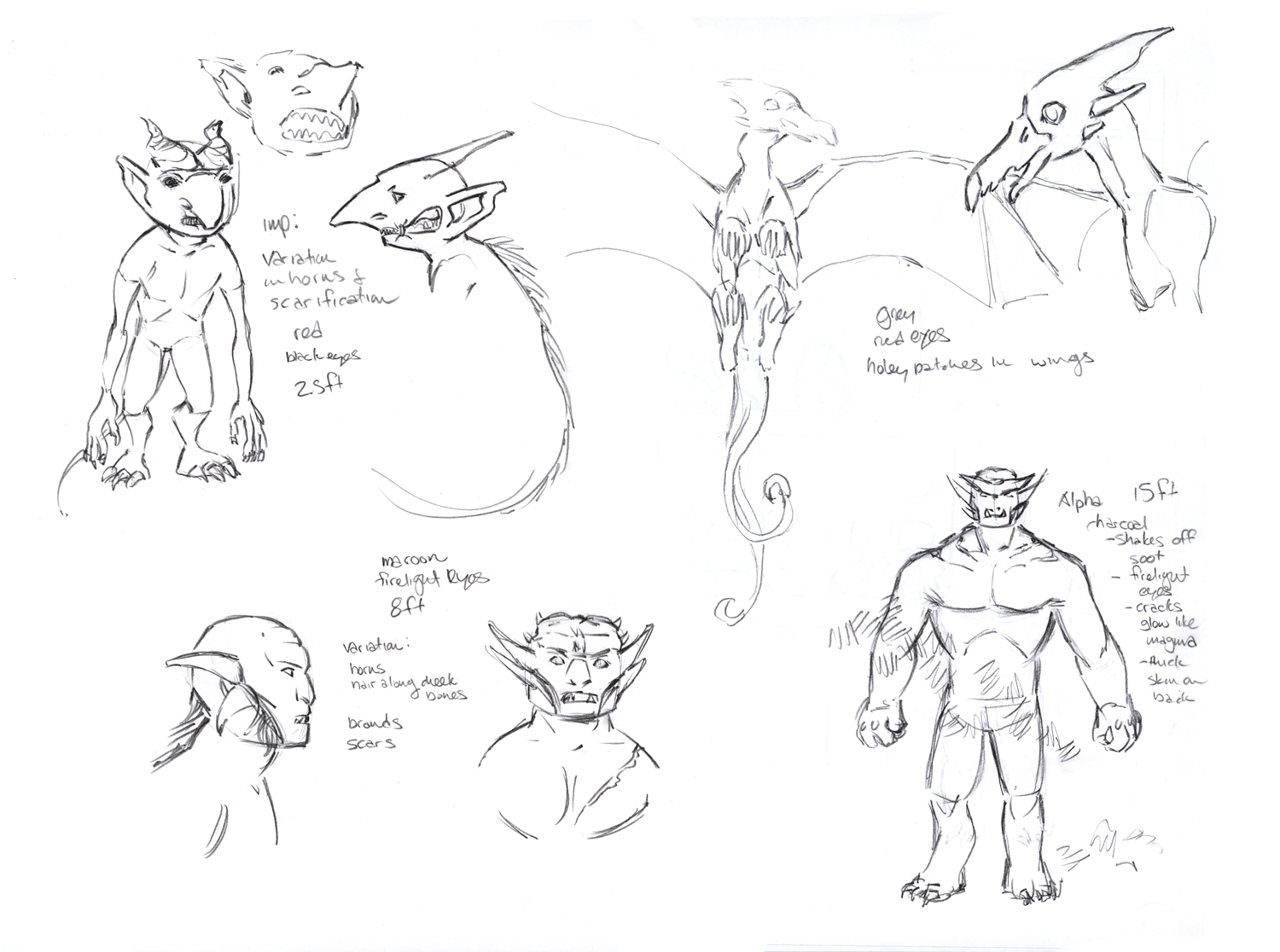
STS-53: Demon Designs
What would a fantasy story be without monsters? Of Stars and Swords has been a slow burn in that direction, but now we've got demons! There's not much to see in the comic pages just yet, so how about a look at Caroline's design sketches?
In other Of Stars and Swords news, you can now buy Issue 0 on Comixology! The other issues are coming, as well! Speaking of that, Issue 4 begins on June 26!
Thursday, February 21, 2013
STS-49: OSAS Underground Designs
Half of the group of heroes in Of Stars and Swords has journeyed into a fairly standard fantasy location: underground tunnels and roads. For reference, the scene at the waypoint begins here, Issue 3 - Page 5.
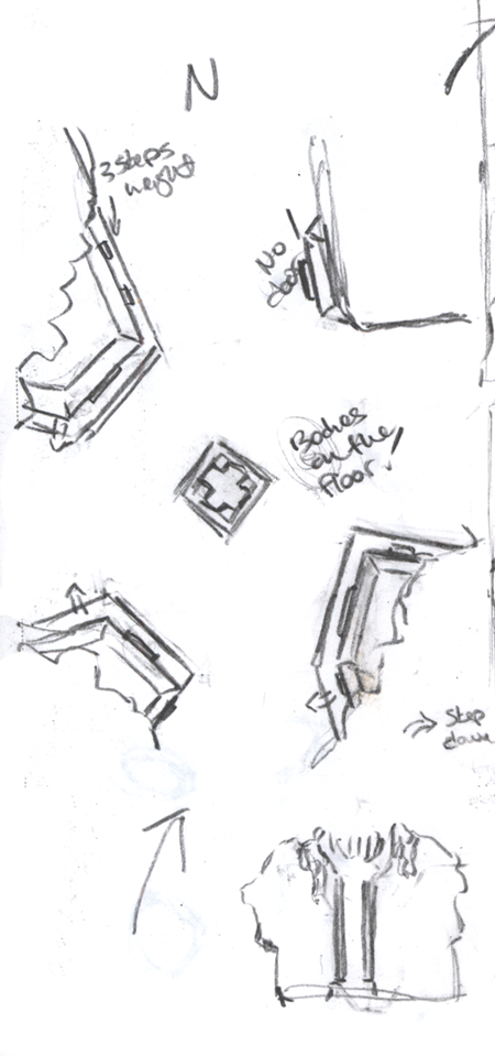
The location where most of the action would take place was a waypoint, like a small village between cities to provide a place for travelers to rest. For reference, one of the first things Caroline did was to put together a nice little overhead view of the waypoint so we knew the area.
Overall, it's really just a simple crossroads with buildings carved into the four corners. So it didn't get too boring, we put a huge column in the center, carved with runes as a road sign of sorts. You can see the height and shape of the column at the bottom of this page of sketches.
We also didn't want things to just be boring rock and columns, so Caroline and I talked things over a little bit, and then she went crazy designing creatures of various kinds and tons of plant life for the environment. The sad thing is, a lot of these little guys we just don't have a chance to show, but it helped to get a feel for what the underground world is like.
The location where most of the action would take place was a waypoint, like a small village between cities to provide a place for travelers to rest. For reference, one of the first things Caroline did was to put together a nice little overhead view of the waypoint so we knew the area.
Overall, it's really just a simple crossroads with buildings carved into the four corners. So it didn't get too boring, we put a huge column in the center, carved with runes as a road sign of sorts. You can see the height and shape of the column at the bottom of this page of sketches.
We also didn't want things to just be boring rock and columns, so Caroline and I talked things over a little bit, and then she went crazy designing creatures of various kinds and tons of plant life for the environment. The sad thing is, a lot of these little guys we just don't have a chance to show, but it helped to get a feel for what the underground world is like.
Wednesday, November 28, 2012
STS-45: Redesigns
Through the comic, we've reached a few points where I've come to realize that a particular character design just isn't working, or needs to change to fit where the story is.
Aram got a complete redesign between issue 0 and 1. His original costume was too garish and all over the place. When the comic headed in a more grounded direction, he needed a more unified and realistic wardrobe. So he went from some weird Korean/caveman combo to barefoot Frontiersman.
At the same time, Nika got tweaked a little. Her gypsy skirts were replaced with a heavy wool skirt and thick belt, her ballet-inspired slippers became baggy boots, we cut off her long ponytail to give her a rough charm (and to remove the genie semblance), and added a long necklace to give back some girliness.
Seren went from long hair to short at the same time, and upgraded her knives. But her haircut was not a redesign. It was something she did herself, off camera, probably with one of her daggers. In a perfect world, all the other character changes would not have needed to happen, and Seren's own subtle change would be more unique.
Lately, Marguerite's design just hasn't been working for me. She seems out of place, even for a mystical creature. My main concern was to make her look more resilient. While I loved her original design, I felt she needed more coverage up top, and more weight in her outfit below to balance the design and allow the loose fabric of her dress to really pop. And real shoes. No one, no matter how magical, should have to trek across the countryside in dress sandals.
So from left to right: First we have Marguerite's original design, by Karen Ledford of Melfina Cosplay. Second is our concept for her, though in the comic I never put the necklace and I pinched her waist more and lengthened the dress. Last is the new design that will pop up next issue. (hah! And I didn't notice until now that I put her in the same pose as Karen did!)
It was a challenge to stay true to the silhouette and colors balance of the original. I also had to make sure I wasn't repeating design elements inherent in the other characters' outfits, so cap sleeves, loose sleeves, and longer gloves were not an option. The boot covers are a favorite of mine that I've been itching to use, and keep the boots from being too Sailor Moon.
Aram got a complete redesign between issue 0 and 1. His original costume was too garish and all over the place. When the comic headed in a more grounded direction, he needed a more unified and realistic wardrobe. So he went from some weird Korean/caveman combo to barefoot Frontiersman.
At the same time, Nika got tweaked a little. Her gypsy skirts were replaced with a heavy wool skirt and thick belt, her ballet-inspired slippers became baggy boots, we cut off her long ponytail to give her a rough charm (and to remove the genie semblance), and added a long necklace to give back some girliness.
Seren went from long hair to short at the same time, and upgraded her knives. But her haircut was not a redesign. It was something she did herself, off camera, probably with one of her daggers. In a perfect world, all the other character changes would not have needed to happen, and Seren's own subtle change would be more unique.
-----------------------------------------------------------------------------------------
Lately, Marguerite's design just hasn't been working for me. She seems out of place, even for a mystical creature. My main concern was to make her look more resilient. While I loved her original design, I felt she needed more coverage up top, and more weight in her outfit below to balance the design and allow the loose fabric of her dress to really pop. And real shoes. No one, no matter how magical, should have to trek across the countryside in dress sandals.
So from left to right: First we have Marguerite's original design, by Karen Ledford of Melfina Cosplay. Second is our concept for her, though in the comic I never put the necklace and I pinched her waist more and lengthened the dress. Last is the new design that will pop up next issue. (hah! And I didn't notice until now that I put her in the same pose as Karen did!)
It was a challenge to stay true to the silhouette and colors balance of the original. I also had to make sure I wasn't repeating design elements inherent in the other characters' outfits, so cap sleeves, loose sleeves, and longer gloves were not an option. The boot covers are a favorite of mine that I've been itching to use, and keep the boots from being too Sailor Moon.
Wednesday, November 7, 2012
STS-44: Alternate Of Stars and Swords Page
Alright. Due to sickness, we had no Of Stars and Swords update this week. It's the first week we've failed to update since launching, and it bothered us both a great deal, but it was the best decision. Caroline, especially, has needed the time to recover from whatever hell we both managed to catch.
But it's Wednesday and I feel wrong not putting SOMETHING online for people to enjoy. So I've got something for you all, and I like to call it the reason why we don't let Caroline do the writing...or, alternatively, the reason why we should have her doing all the writing.
Below is the version of last week's page that Caroline gave me to letter. These days, she always does some flatting before I get the page, so color of various kinds is not out of the ordinary. But for this, she decided that she would put in her own words...

Just in case it wasn't obvious from the text and the color choices, Caroline enjoys turtles.
But it's Wednesday and I feel wrong not putting SOMETHING online for people to enjoy. So I've got something for you all, and I like to call it the reason why we don't let Caroline do the writing...or, alternatively, the reason why we should have her doing all the writing.
Below is the version of last week's page that Caroline gave me to letter. These days, she always does some flatting before I get the page, so color of various kinds is not out of the ordinary. But for this, she decided that she would put in her own words...
Just in case it wasn't obvious from the text and the color choices, Caroline enjoys turtles.
Tuesday, September 18, 2012
STS-42: OSAS Splash Page Layout
Hey, everyone! Last week's Of Stars and Swords page was a big splash page that Caroline nearly killed her hand and eyes on. It's only fair to give you a look at the layout she put together, since this is one of the rare times she put together every step of the art. So here's her layout sketches which you can compare with the actual page by clicking this link!
Tuesday, May 29, 2012
STS-39: Scifi Comic Preview - Headshots
Hey, everyone! We've been a little quiet on the blog due to chugging along on Of Stars and Swords. Hope you're reading and enjoying it, but this post is about another project we're working on.
Unlike Of Stars and Swords, I'll be handling the heavy lifting on the art, with Caroline only inking me and doing some basic colors (unless the plan changes on that end). So that means I've been spending a lot of time forcing my own art skills back into shape. It's rough, and I'm getting quite a lot of assistance from Caroline to have work that's actually presentable, but it's finally paying off.
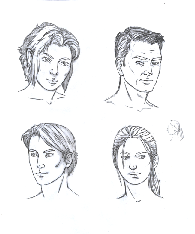
So as a little preview of things, here are the headshots of four major characters for an upcoming Science Fiction comic. I'm in the process of putting together an 8 page short comic to get this off the ground, and the pencils on that should start coming along soon. After that, a full launch is to come!
Unlike Of Stars and Swords, I'll be handling the heavy lifting on the art, with Caroline only inking me and doing some basic colors (unless the plan changes on that end). So that means I've been spending a lot of time forcing my own art skills back into shape. It's rough, and I'm getting quite a lot of assistance from Caroline to have work that's actually presentable, but it's finally paying off.
So as a little preview of things, here are the headshots of four major characters for an upcoming Science Fiction comic. I'm in the process of putting together an 8 page short comic to get this off the ground, and the pencils on that should start coming along soon. After that, a full launch is to come!
Wednesday, April 4, 2012
STS-38: Process
Hey, everyone! I know it's been a little while since we've updated the blog, but we've been busy. Excuses, I know. However! Here's a nice, meaty update for you all to enjoy.
As of today, our webcomic, Of Stars and Swords is up to Page 5 of Issue 1, technically page 25 overall. And with this page, we figured this would be a good time to give a rundown of our process in creating all of this. I'm not going to go into too much detail, but feel free to ask any questions. We might do some more detailed process posts later if you like this one!
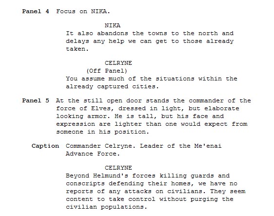
So. First up, the script for Page 5!
A couple things on the script. This page, and the next year's worth of scripts I've written for Of Stars and Swords was written in Celtx. It's a great free program with a built in comic script format that I love. Only problem is, exporting the files in other usable formats isn't really that easy. I still love the program, but I'm now doing the bulk of my script writing in Scrivener. It's a very complicated program, but also insanely powerful and exactly what I need since I make tons of outlines and other notes that the program can all combine together while I write the script.
Now, as for actual process. This script was written well over a year ago now. In some ways, that's a good and bad thing. The bad part is obvious. It's older and hopefully I'm a better writer now that a full year has past. But the good is that I can look at this script again, but as if someone else entirely wrote it. The main problem? It's wordy. Now, this is a page of heavy exposition for a scene that's basically setting up the conflict of our entire plot, so it's going to be wordy to a point. It is, however, too wordy. There's a limit to how many word balloons you can cram onto a page before it just becomes unreadable, and this script has it right on the edge.
Thus, it gets edited down. Now, where the edits happen tends to vary. I try to do them on the actual script, but that doesn't always happen. This is a case where the edits are actually on the lettering stage, so we'll get to that in just a bit.
Layouts are next!
Layouts for the page are something I also handle. With the script in front of me, I do exactly what you see happening there. I'll draw out various ideas for how to break down the panels. This page is an interesting one to see, as three of those quick sketches look almost identical. This tends to happen when my head gets stuck in one area. I don't erase them because it's me working them out as I go, and I usually don't realize I've made an identical layout until I look at them both. That means two things to me: Either I've hit on the right layout for the page right away, or I'm not thinking outside the box enough.
I figured it was the latter on this one and got Caroline's input. The two page layouts on the right are what happened when she and I talked it through. You can see that it's the same basic idea, but trying to push it into something a little more visually interesting. The top right one was exactly what I had been trying to find, so then I do a slightly larger version of the page with very, very rough sketches of where everything goes. It's crude, I know, but the point isn't to look good so much as to get an idea for how much space everything should take up on the page and, just as important, where the word balloons will fit.
Also, on this page, we had to introduce a new character that we'd yet to design. So Caroline and I talked him out while she sketched and there you have the face of our Elf Commander. We really wanted to keep him from that usual long haired, girly-looking stereotype and I really like how he came together.
After that's done, I pull out a full art board and get the panel borders mapped out. Then I take it down to Caroline and she gets to hold it hostage for the next few steps!
Using my layouts as a rough framework, Caroline puts the pencils you see above together. On this page, she mostly stuck to the placements I had set out, but if you look closely you can see that panel two is now zoomed out just a bit and she's added in Barstof in the background rather than ignore him entirely. She also zoomed out on Nika in panel four and played with her pose, and this, thankfully, gave more room for the text.
There are times where my layouts are simply ideas for Caroline to use to get someplace even better. It really just depends on the exact material and how bland my layouts are. We're making a real effort to change up camera angles and not use too many of the same shots, but it's easy to fall into habits if you don't have someone else constantly checking on you.
When the pencils are done, I scan the page and give it right back to Caroline so she can ink it. All her inking is done traditionally using nibs (a Hunt 512 for thicker lines and a Hunt 102 for details) and acrylic ink. This is the point to really nail down where the blacks are going to go, and balancing that amongst the entire page is very important so as not to distract the eye too much. With a lot of inking in comics these days, it's just one stage, but we do things a little differently for Of Stars and Swords.
After the blacks are down, Caroline puts down an ink wash of watered-down acrylic ink.
Caroline uses the wash to help add texture to the page. It also is a precursor for how she colors, putting in basic shadows that will be expanded on during the coloring process.
This is a stage I've wondered if we should skip, simply keeping the more structured black inks, but the wash adds so much life and depth to the pages that it would be a mistake.
After this is done, the page is scanned yet again, and then Caroline adds color!
Here with the colors, things are finally digital. Caroline does all of this in Photoshop. The ink wash gets tinted various colors based on what is being shaded and you can see how it adds a great deal of depth to the final look of the page.
Now, this next image you're going to want to click as it's pretty big.
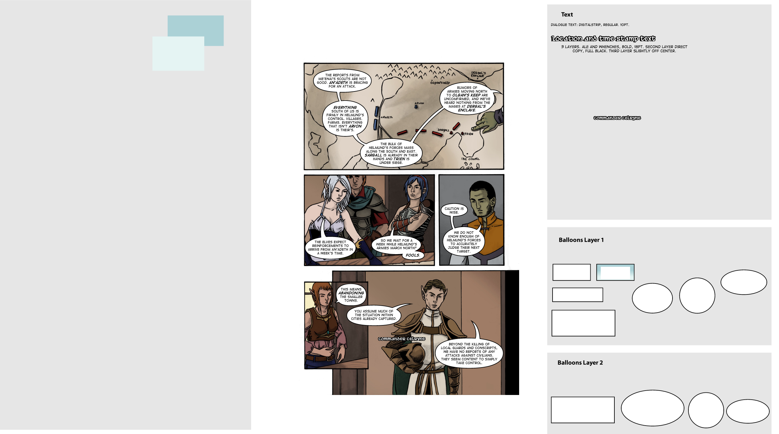
That right there is the template I use for lettering in Illustrator. The idea for this kind of template is something I have shamelessly taken from Scott McCloud, and it has taken lettering from something I dread to something I love doing. Once Caroline is done coloring, and sometimes before depending on how fast things are going, I take a low res version of the page and drop it into the center of my template to start lettering.
As you can see, I have pre-made balloons ready to be copied over. They are also immediately ready for text to go in them. There are two layers so that some balloons can be on top of others if necessary. It's worth noting that the outlines for my balloons are not individually constructed, but an actual property of the layer they're on, so it's much easy to slide balloons together like you see in Chloe's line on Panel 2. I don't use templates for tails, however. I prefer to make those based on where the balloons are placed and work them out more naturally.
That big open spot on the left is for any color swatches or various other things I might need. As you can see, there are only two things there right now. Those are the colors of the gradient for Seren's captions, which you can see combined in a caption box over on the other side. That other grey area with text information is where I play with sizes and shapes of things. You can see the commander's nameplate in a slightly different form there.
And as I mentioned before, if you look at the text and compare it to the original script, you can see where edits were made for clarity or simply because I wrote way too much. Also, you can now see why the entire left side of the map was empty, as it's now almost completely covered by text.
After all that's done, Caroline looks it over to make sure I didn't make any typos or other stupid errors. Which I tend to make. Quite a lot. So I fix those, give her the file, and she puts it all together and puts it on a torn-page template she made for us. And...here it is, finished and hopefully looking better than that script could have hinted at!
As of today, our webcomic, Of Stars and Swords is up to Page 5 of Issue 1, technically page 25 overall. And with this page, we figured this would be a good time to give a rundown of our process in creating all of this. I'm not going to go into too much detail, but feel free to ask any questions. We might do some more detailed process posts later if you like this one!
So. First up, the script for Page 5!
A couple things on the script. This page, and the next year's worth of scripts I've written for Of Stars and Swords was written in Celtx. It's a great free program with a built in comic script format that I love. Only problem is, exporting the files in other usable formats isn't really that easy. I still love the program, but I'm now doing the bulk of my script writing in Scrivener. It's a very complicated program, but also insanely powerful and exactly what I need since I make tons of outlines and other notes that the program can all combine together while I write the script.
Now, as for actual process. This script was written well over a year ago now. In some ways, that's a good and bad thing. The bad part is obvious. It's older and hopefully I'm a better writer now that a full year has past. But the good is that I can look at this script again, but as if someone else entirely wrote it. The main problem? It's wordy. Now, this is a page of heavy exposition for a scene that's basically setting up the conflict of our entire plot, so it's going to be wordy to a point. It is, however, too wordy. There's a limit to how many word balloons you can cram onto a page before it just becomes unreadable, and this script has it right on the edge.
Thus, it gets edited down. Now, where the edits happen tends to vary. I try to do them on the actual script, but that doesn't always happen. This is a case where the edits are actually on the lettering stage, so we'll get to that in just a bit.
Layouts are next!
Layouts for the page are something I also handle. With the script in front of me, I do exactly what you see happening there. I'll draw out various ideas for how to break down the panels. This page is an interesting one to see, as three of those quick sketches look almost identical. This tends to happen when my head gets stuck in one area. I don't erase them because it's me working them out as I go, and I usually don't realize I've made an identical layout until I look at them both. That means two things to me: Either I've hit on the right layout for the page right away, or I'm not thinking outside the box enough.
I figured it was the latter on this one and got Caroline's input. The two page layouts on the right are what happened when she and I talked it through. You can see that it's the same basic idea, but trying to push it into something a little more visually interesting. The top right one was exactly what I had been trying to find, so then I do a slightly larger version of the page with very, very rough sketches of where everything goes. It's crude, I know, but the point isn't to look good so much as to get an idea for how much space everything should take up on the page and, just as important, where the word balloons will fit.
Also, on this page, we had to introduce a new character that we'd yet to design. So Caroline and I talked him out while she sketched and there you have the face of our Elf Commander. We really wanted to keep him from that usual long haired, girly-looking stereotype and I really like how he came together.
After that's done, I pull out a full art board and get the panel borders mapped out. Then I take it down to Caroline and she gets to hold it hostage for the next few steps!
Using my layouts as a rough framework, Caroline puts the pencils you see above together. On this page, she mostly stuck to the placements I had set out, but if you look closely you can see that panel two is now zoomed out just a bit and she's added in Barstof in the background rather than ignore him entirely. She also zoomed out on Nika in panel four and played with her pose, and this, thankfully, gave more room for the text.
There are times where my layouts are simply ideas for Caroline to use to get someplace even better. It really just depends on the exact material and how bland my layouts are. We're making a real effort to change up camera angles and not use too many of the same shots, but it's easy to fall into habits if you don't have someone else constantly checking on you.
When the pencils are done, I scan the page and give it right back to Caroline so she can ink it. All her inking is done traditionally using nibs (a Hunt 512 for thicker lines and a Hunt 102 for details) and acrylic ink. This is the point to really nail down where the blacks are going to go, and balancing that amongst the entire page is very important so as not to distract the eye too much. With a lot of inking in comics these days, it's just one stage, but we do things a little differently for Of Stars and Swords.
After the blacks are down, Caroline puts down an ink wash of watered-down acrylic ink.
Caroline uses the wash to help add texture to the page. It also is a precursor for how she colors, putting in basic shadows that will be expanded on during the coloring process.
This is a stage I've wondered if we should skip, simply keeping the more structured black inks, but the wash adds so much life and depth to the pages that it would be a mistake.
After this is done, the page is scanned yet again, and then Caroline adds color!
Here with the colors, things are finally digital. Caroline does all of this in Photoshop. The ink wash gets tinted various colors based on what is being shaded and you can see how it adds a great deal of depth to the final look of the page.
Now, this next image you're going to want to click as it's pretty big.
That right there is the template I use for lettering in Illustrator. The idea for this kind of template is something I have shamelessly taken from Scott McCloud, and it has taken lettering from something I dread to something I love doing. Once Caroline is done coloring, and sometimes before depending on how fast things are going, I take a low res version of the page and drop it into the center of my template to start lettering.
As you can see, I have pre-made balloons ready to be copied over. They are also immediately ready for text to go in them. There are two layers so that some balloons can be on top of others if necessary. It's worth noting that the outlines for my balloons are not individually constructed, but an actual property of the layer they're on, so it's much easy to slide balloons together like you see in Chloe's line on Panel 2. I don't use templates for tails, however. I prefer to make those based on where the balloons are placed and work them out more naturally.
That big open spot on the left is for any color swatches or various other things I might need. As you can see, there are only two things there right now. Those are the colors of the gradient for Seren's captions, which you can see combined in a caption box over on the other side. That other grey area with text information is where I play with sizes and shapes of things. You can see the commander's nameplate in a slightly different form there.
And as I mentioned before, if you look at the text and compare it to the original script, you can see where edits were made for clarity or simply because I wrote way too much. Also, you can now see why the entire left side of the map was empty, as it's now almost completely covered by text.
After all that's done, Caroline looks it over to make sure I didn't make any typos or other stupid errors. Which I tend to make. Quite a lot. So I fix those, give her the file, and she puts it all together and puts it on a torn-page template she made for us. And...here it is, finished and hopefully looking better than that script could have hinted at!
Subscribe to:
Posts (Atom)