Hey, everyone! I know it's been a little while since we've updated the blog, but we've been busy. Excuses, I know. However! Here's a nice, meaty update for you all to enjoy.
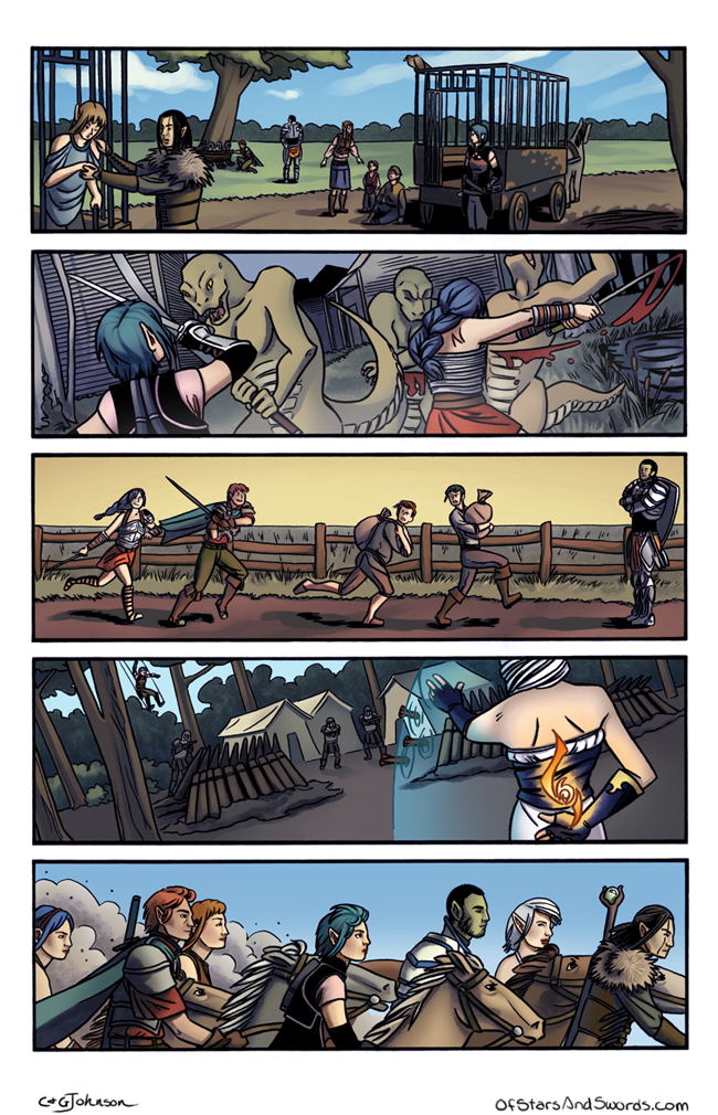
As of today, our webcomic,
Of Stars and Swords is up to Page 5 of Issue 1, technically page 25 overall. And with this page, we figured this would be a good time to give a rundown of our process in creating all of this. I'm not going to go into too much detail, but feel free to ask any questions. We might do some more detailed process posts later if you like this one!
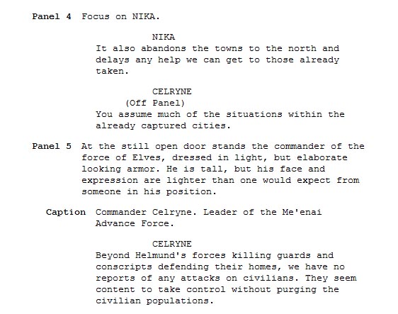
So. First up, the script for Page 5!
A couple things on the script. This page, and the next year's worth of scripts I've written for Of Stars and Swords was written in
Celtx. It's a great free program with a built in comic script format that I love. Only problem is, exporting the files in other usable formats isn't really that easy. I still love the program, but I'm now doing the bulk of my script writing in
Scrivener. It's a very complicated program, but also insanely powerful and exactly what I need since I make tons of outlines and other notes that the program can all combine together while I write the script.
Now, as for actual process. This script was written well over a year ago now. In some ways, that's a good and bad thing. The bad part is obvious. It's older and hopefully I'm a better writer now that a full year has past. But the good is that I can look at this script again, but as if someone else entirely wrote it. The main problem? It's wordy. Now, this is a page of heavy exposition for a scene that's basically setting up the conflict of our entire plot, so it's going to be wordy to a point. It is, however, too wordy. There's a limit to how many word balloons you can cram onto a page before it just becomes unreadable, and this script has it right on the edge.
Thus, it gets edited down. Now, where the edits happen tends to vary. I try to do them on the actual script, but that doesn't always happen. This is a case where the edits are actually on the lettering stage, so we'll get to that in just a bit.
Layouts are next!
Layouts for the page are something I also handle. With the script in front of me, I do exactly what you see happening there. I'll draw out various ideas for how to break down the panels. This page is an interesting one to see, as three of those quick sketches look almost identical. This tends to happen when my head gets stuck in one area. I don't erase them because it's me working them out as I go, and I usually don't realize I've made an identical layout until I look at them both. That means two things to me: Either I've hit on the right layout for the page right away, or I'm not thinking outside the box enough.
I figured it was the latter on this one and got Caroline's input. The two page layouts on the right are what happened when she and I talked it through. You can see that it's the same basic idea, but trying to push it into something a little more visually interesting. The top right one was exactly what I had been trying to find, so then I do a slightly larger version of the page with very, very rough sketches of where everything goes. It's crude, I know, but the point isn't to look good so much as to get an idea for how much space everything should take up on the page and, just as important, where the word balloons will fit.
Also, on this page, we had to introduce a new character that we'd yet to design. So Caroline and I talked him out while she sketched and there you have the face of our Elf Commander. We really wanted to keep him from that usual long haired, girly-looking stereotype and I really like how he came together.
After that's done, I pull out a full art board and get the panel borders mapped out. Then I take it down to Caroline and she gets to hold it hostage for the next few steps!
Using my layouts as a rough framework, Caroline puts the pencils you see above together. On this page, she mostly stuck to the placements I had set out, but if you look closely you can see that panel two is now zoomed out just a bit and she's added in Barstof in the background rather than ignore him entirely. She also zoomed out on Nika in panel four and played with her pose, and this, thankfully, gave more room for the text.
There are times where my layouts are simply ideas for Caroline to use to get someplace even better. It really just depends on the exact material and how bland my layouts are. We're making a real effort to change up camera angles and not use too many of the same shots, but it's easy to fall into habits if you don't have someone else constantly checking on you.
When the pencils are done, I scan the page and give it right back to Caroline so she can ink it. All her inking is done traditionally using nibs (a Hunt 512 for thicker lines and a Hunt 102 for details) and acrylic ink. This is the point to really nail down where the blacks are going to go, and balancing that amongst the entire page is very important so as not to distract the eye too much. With a lot of inking in comics these days, it's just one stage, but we do things a little differently for Of Stars and Swords.
After the blacks are down, Caroline puts down an ink wash of watered-down acrylic ink.
Caroline uses the wash to help add texture to the page. It also is a precursor for how she colors, putting in basic shadows that will be expanded on during the coloring process.
This is a stage I've wondered if we should skip, simply keeping the more structured black inks, but the wash adds so much life and depth to the pages that it would be a mistake.
After this is done, the page is scanned yet again, and then Caroline adds color!
Here with the colors, things are finally digital. Caroline does all of this in Photoshop. The ink wash gets tinted various colors based on what is being shaded and you can see how it adds a great deal of depth to the final look of the page.
Now, this next image you're going to want to click as it's pretty big.
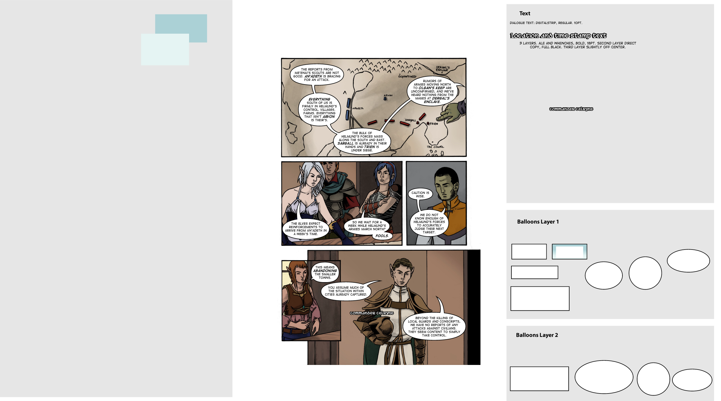
That right there is the template I use for lettering in Illustrator. The idea for this kind of template is something I have shamelessly taken from Scott McCloud, and it has taken lettering from something I dread to something I love doing. Once Caroline is done coloring, and sometimes before depending on how fast things are going, I take a low res version of the page and drop it into the center of my template to start lettering.
As you can see, I have pre-made balloons ready to be copied over. They are also immediately ready for text to go in them. There are two layers so that some balloons can be on top of others if necessary. It's worth noting that the outlines for my balloons are not individually constructed, but an actual property of the layer they're on, so it's much easy to slide balloons together like you see in Chloe's line on Panel 2. I don't use templates for tails, however. I prefer to make those based on where the balloons are placed and work them out more naturally.
That big open spot on the left is for any color swatches or various other things I might need. As you can see, there are only two things there right now. Those are the colors of the gradient for Seren's captions, which you can see combined in a caption box over on the other side. That other grey area with text information is where I play with sizes and shapes of things. You can see the commander's nameplate in a slightly different form there.
And as I mentioned before, if you look at the text and compare it to the original script, you can see where edits were made for clarity or simply because I wrote way too much. Also, you can now see why the entire left side of the map was empty, as it's now almost completely covered by text.
After all that's done, Caroline looks it over to make sure I didn't make any typos or other stupid errors. Which I tend to make. Quite a lot. So I fix those, give her the file, and she puts it all together and puts it on a torn-page template she made for us. And...here it is, finished and hopefully looking better than that script could have hinted at!