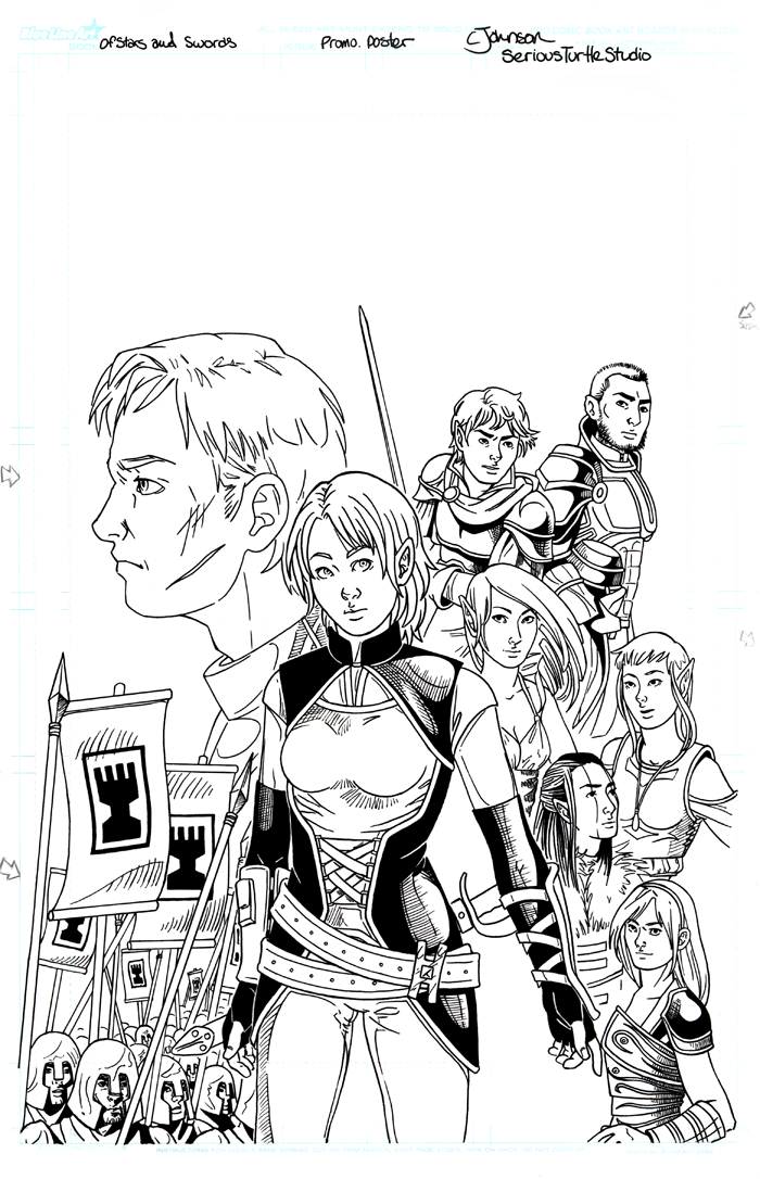
Okay, so here's a little bit more than just art. This is the same flyer we showed the pencils on a few days back, but this time, it's inked! Here's the usual straight-blacks that one normally gets with these kinds of things. Now, there aren't a lot of heavy blacks here. They're mostly being used to pull Seren out from the background elements. But the other reason is this isn't the last step for inking when it comes to Of Stars and Swords.
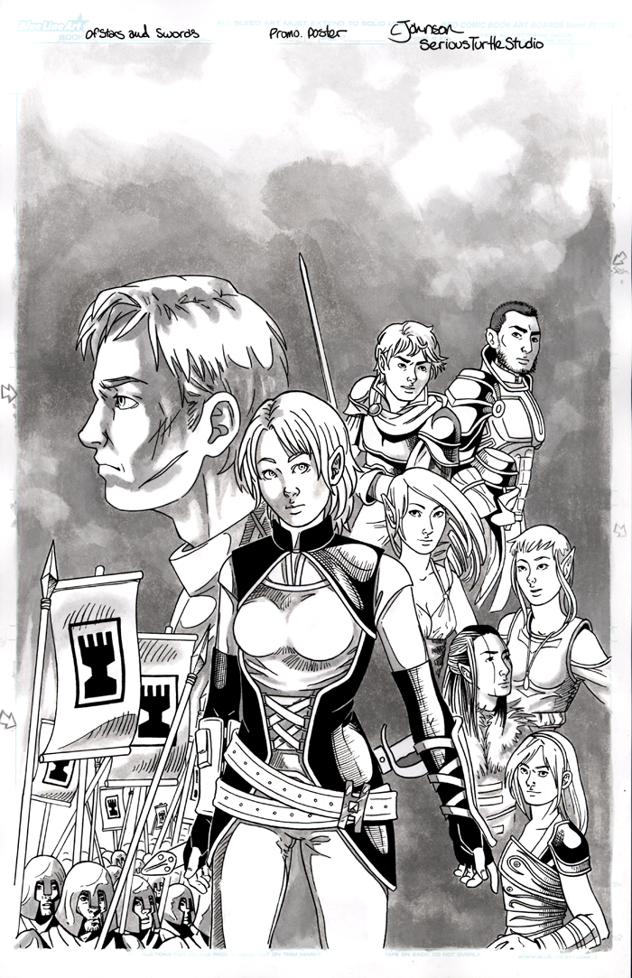
After the blacks are in, all the pages get a nice wash of grey. Caroline uses this to help define subtler tones and shading. It also adds something to the overall feel of the finished pages, giving them an older, rougher look that helps the mood of a fantasy comic. Plus, as great as the black always look when she's done with that step, the greys just pull everything together. Here, especially, you can start to see what's going to happen with the background and where the logo/text is going to go.
Fully colored and text-filled version to come soon! Hope you like it and I hope you're keeping up with the comic, too!


No comments:
Post a Comment